Northbrook, IL. September 21, 2023 — Liventus, a leading technology solutions and services provider, proudly announces its spot at #35 in the prestigious Crain’s Best Places to Work in Chicago 2023 list. This recognition by Crain’s Chicago Business, a premier and trusted source for regional business insights, underscores Liventus’ thriving work culture and dedication to employees’ […]
Introduction The equipment finance industry has undergone significant transformations in recent years, driven by technological advancements, evolving customer preferences, and heightened competition. To ensure a prosperous future, equipment finance companies must anticipate these changes and adapt their business strategies accordingly. In this article, we will explore the prevailing trends in the equipment finance sector and […]
In today’s digital age, data is an asset, and businesses of all sizes must find ways to extract insights from the large volumes of data they collect. Data analytics tools play a critical role in this process by providing businesses with the tools they need to process, analyze, and visualize their data. These tools enable […]
Introduction In today’s digital age, eCommerce has become essential to our lives. With the increase in online shopping, the importance of eCommerce data security has also grown significantly. eCommerce data security refers to the measures taken to protect sensitive information exchanged during online transactions on eCommerce websites. It includes personal information, such as names, addresses, […]
Introduction As a small or mid-size business, there are various factors to consider. While selling cutting-edge products, providing a varied range of services, and having a solid marketing plan is crucial, you must build and sustain long-term customer relationships. This is precisely where CRM comes into the picture. Customer Relationship Management (CRM) is a must-have […]
Artificial intelligence (AI) is increasingly significant in the equipment finance industry, driving its rapid development and transformation. This article explores the various applications of AI in equipment finance, highlighting its benefits and drawbacks while also considering the potential long-term effects. Understanding Artificial Intelligence (AI) Artificial intelligence (AI) encompasses various techniques and approaches that enable machines […]
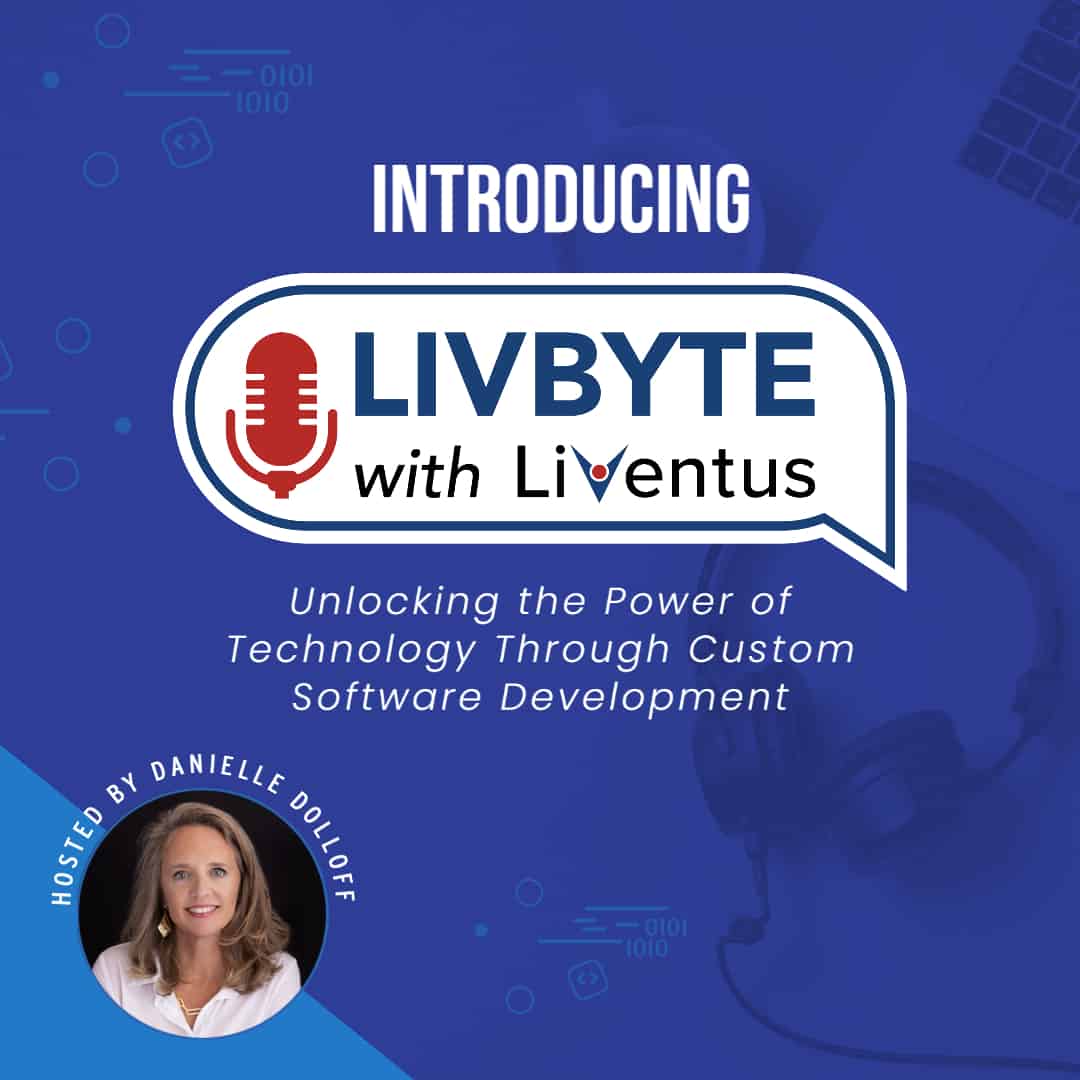
Introduction In today’s digital landscape, podcasts have gained immense popularity, offering a unique platform for sharing information and engaging discussions. With LivByte, we want to start the conversation on everything custom software development and the tech industry. This article delves into the story behind the LivByte Podcast, featuring an exclusive interview with Danielle Dolloff, the […]
Introduction For any online business to succeed, it is essential to have better customer interaction and engagement. In this case, an Ecommerce CRM stands as a valuable tool. It helps businesses streamline operations, improve customer experience, and drive growth. It’s an all-in-one platform that combines various functionalities, such as customer data management, marketing automation, sales, […]
Northbrook, IL. March 15, 2023 — Northbrook, IL. March 15, 2023 — Liventus is proud to have sponsored and donated to ASPIRE, a local charity that helps adults with disabilities. Their contribution played a vital role in the success of ASPIRE’s Big City Nights Gala, which raised an unprecedented amount of money to further their mission of […]
Northbrook, IL. March 09, 2023 — Liventus, leading technology services and solutions provider, announced today that it had received Certification as a Great Place to Work for 2023-2024. The Certification is awarded by the Great Place to Work Institute, an independent authority on high-trust, high-performance workplace cultures. This prestigious recognition highlights Liventus’ commitment to building a […]
This site uses functional cookies and external scripts to improve your experience.
This website uses cookies to improve your experience while you navigate through the website. Out of these, the cookies that are categorized as necessary are stored on your browser as they are essential for the working of basic functionalities of the website. We also use third-party cookies that help us analyze and understand how you use this website. These cookies will be stored in your browser only with your consent. You also have the option to opt-out of these cookies. But opting out of some of these cookies may affect your browsing experience.
Necessary cookies are absolutely essential for the website to function properly. These cookies ensure basic functionalities and security features of the website, anonymously.
Cookie
Duration
Description
cookielawinfo-checkbox-analytics
11 months
This cookie is set by GDPR Cookie Consent plugin. The cookie is used to store the user consent for the cookies in the category "Analytics".
cookielawinfo-checkbox-functional
11 months
The cookie is set by GDPR cookie consent to record the user consent for the cookies in the category "Functional".
cookielawinfo-checkbox-necessary
11 months
This cookie is set by GDPR Cookie Consent plugin. The cookies is used to store the user consent for the cookies in the category "Necessary".
cookielawinfo-checkbox-others
11 months
This cookie is set by GDPR Cookie Consent plugin. The cookie is used to store the user consent for the cookies in the category "Other.
cookielawinfo-checkbox-performance
11 months
This cookie is set by GDPR Cookie Consent plugin. The cookie is used to store the user consent for the cookies in the category "Performance".
viewed_cookie_policy
11 months
The cookie is set by the GDPR Cookie Consent plugin and is used to store whether or not user has consented to the use of cookies. It does not store any personal data.
Functional cookies help to perform certain functionalities like sharing the content of the website on social media platforms, collect feedbacks, and other third-party features.
Performance cookies are used to understand and analyze the key performance indexes of the website which helps in delivering a better user experience for the visitors.
Analytical cookies are used to understand how visitors interact with the website. These cookies help provide information on metrics the number of visitors, bounce rate, traffic source, etc.
Advertisement cookies are used to provide visitors with relevant ads and marketing campaigns. These cookies track visitors across websites and collect information to provide customized ads.


 How to Prepare Your Equipment Finance Company for the Future